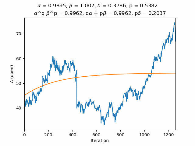
The value of the stock is compared to the formula
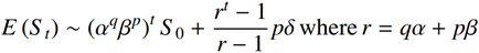
where
-
t is time
-
S0 is the initial price
-
The stock moves down with probability q by, on average, a factor of α
-
The stock moves up with probability p by, on average, a factor of β and a shift of δ
How stock values grow
The smooth line imposed on the pictures is not a curve fit, it is a noise fit. Every toss of a coin that moves the stock up or down is recorded and converted to a probability. The size of every move up is recorded and a curve is fitted to those values, similarly for every move down. The values from that noise are then fed into a model to get the curve which is plotted on top of the daily movements.
In 1900 Bachelier invented Brownian Motion, 5 years before Einstein. Asset price growth is linear plus noise. In 1963 Mandlebrot showed that cotton prices do not follow Brownian Motion and it came to be replaced by Geometric Brownian Motion in which asset price growth is exponential plus noise. The noise fits shown are obviously not exponential growth, but rather the result of a mix of exponential growth plus another term.
-
Offset returns => Normal distribution => Brownian motion
-
Linear returns => Log-Normal distribution => Geometric Brownian motion
-
Affine returns => Log-Normal distribution + other => Geometric Brownian motion + other
Where the other distribution looks like a scaled logit-normal distribution. Further details are on GitHub.